Wednesday, 31 July 2013

CROCS 'Slip off. Slip in.'

Right, advertising Crocs: talk about being on the back-foot already! [pun done, boom!]

They don't have a particularly good reputation among the teen and young adult consumers, just look:
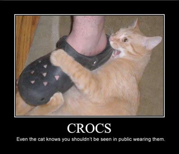
CROCS: Even the cat knows you shouldn't be seen in public wearing them.

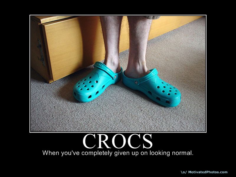
CROCS: When you've completely given up on looking normal.

Birth Control Effectiveness

... and these were among the first images I found when I Googled 'crocs funny'. Not a great position to be in when you're marketing your product to this audience.

So, how do you combat it? How do you reach that core teenage audience and give them a reason to look at your product in a new way? What avenues can you explore and exploit? What do all teenagers have in common and on their minds constantly? SEX. Lots of SEX. You shove sex in it, on it, and all around it. Dress it up in nipple tassels, body glitter, and budgie smugglers and you ram it to the heel down their throats. Here's the ad:


It's fairly amusing, it managed to wheedle out a smirk from you during the first half, so I'll give it that; the rest of it though unfortunately reeks of desperation. They have effectively crow-barred in a concept that must have looked pretty threadbare on paper. Seb (he was probably called Seb) said at the creative stage "What do Crocs have going for them that doesn't have to do with comfort?", the room likely fell silent for a while. Daz (almost certainly a Daz) said "You... erm... you can, like, take them off quickly... when... WHEN YOU'RE BANGIN' BIRDS!" He almost certainly toured the room with high-fives after that; Seb was probably chanting "Ooos oos oos!" How the rest of the room thought this idea was credible enough to be produced is beyond me, save for a genuine lack of any better ideas.

Worst of all is that last situation in the shoeshop with the assistant- who are Crocs trying to kid in having us believe that an attractive young lady is going to eye-bang a punter buying Crocs? No consumer is going to re-evaluate a Croc just because some chap is pretending to get his rocks off in a shoe-store with a lady a few divisions above his punching weight. Certainly the title of the ad doesn't help with the salacious tone of the ad: 'Slip Off. Slip In.' it's genuinely rather gross. I need a shower and an adult.

Unfortunately this is a prime example of a brand struggling to come to terms with its market status. The ad looks like the last death throes of a dying antelope (ugly antelope) being dragged into the murky depths by a crocodile [you see the pun there? more subtle this time]. This is a shoe that just doesn't appeal to the cool demographic they're looking to capitalise on- just like literally anything sensible that parents would actually have their kids actually wear.

Again, that title- just appalling... You can imagine it being whispered in your ear by someone standing far too close and pronouncing the S's just too much. Sssssslip off. Ssssssslip in.

Monday, 10 June 2013

Grandad Tourismo- Visa: Saatchi & Saatchi

Grandad Tourismo! First of all, what a title! I enjoy a good pun, particularly in a professional context; all credit to the agency who snubs popular opinion against punning and willfully scribes a real groaner!

Secondly, a well done to the team for creating a very charming and endearing advert for the new Visa Flow. The agency responsible, Saatchi & Saatchi, summarises the ad nicely: "Visa’s latest execution in the landmark 'Life Flows Better with Visa' campaign focuses on how consumers feel when they use Visa – secure, confident and agile – and encourages them to take their next steps in the new world of payments, making their lives easier, faster and more nimble. The TV ad shows how an old man becomes not only faster and more agile through their use but also more youthful as he rushes to celebrate the birth of his grandchild."

Take a look here: http://www.saatchi.co.uk/work/grandad-tourismo-2/

What they've done well is create a very universal piece- there are very few demographics who wouldn't respond well to this, and certainly very few who could find anything offensive. It's gentle and whimsical, perhaps more like a real-world Pixar animation than a credit card advert, and gives the audience a reason to watch until the end with it's traditional story-style production.

Indeed, likening the production to Pixar is justified in almost all elements; there is barely a scene included that doesn't look like it was plucked out of a storyboard for UP!: the main character, bespectacled and grandfatherly, the pet bird, the beautiful landscapes, and perhaps most notably, the balloons. They all add up to a very warming production- rich colours and a fantastic accompanying track serve to keep audience interested, both visually and audibly. The fast pace and cute details even encourage to watch a second and third time, each time seeing and appreciating something new or different (for example, the use of light in the final scene.)

Have they done anything wrong? Not in my opinion, perhaps the only possible negative response would be that they're playing it a little too safe. It's certainly incredibly well executed, but conceptually it isn't breaking any boundaries- but then, I don't imagine they were trying to? Visa is an established brand and arguably doesn't feel the need to rock the boat like a challenger brand would have to.

Overall, a very endearing and well executed advert, and a fine example of an advert-for-everyone.

Thursday, 25 April 2013

Hyundai: "Pipe Job"

Wow.

What a catastrophic error of misjudgement..

Hyundai, working with Innocean Worldwide Europe, have produced an advert that is treading a verrrrry fine line on what is appropriate. See for yourself:

http://adland.tv/commercials/hyundai-pipe-job-2012-60

There has been quite a visceral backlash to the piece, despite Ian Tonkin – Product & Corporate PR Manager, claiming:

"From our perspective it wasn’t meant to go out, we haven’t used it with the intention of advertising and marketing.
I can’t comment further on this. I can send you through a statement that we’ve put together relating to that advert which will give our stance.
Let me just clarify. With the video we’ve taken it down so it won’t be used in any further advertising. It just went up briefly and we’ve taken it down.
It was initially on an official Hyundai channel but we’ve taken down. It was on briefly last week."

Whether or not it was meant for wholesale public release, and whether or not you actually find it funny, one has to ask: what on earth were they thinking? 

Holly Brockwell, an advertising creative herself, has been the lance at the head of the charge with her blogpost: http://copybot.wordpress.com/2013/04/25/an-open-letter-to-innocean-and-hyundai/

"When your ad started to play, and I saw the beautifully-shot scenes of taped-up car windows with exhaust feeding in, I began to shake. I shook so hard that I had to put down my drink before I spilt it. And then I started to cry.

So I’d like to ask that next time you want to tell the world about a new innovation in car design, you think about it for a little bit longer. Think about me. Think about my dad. And the thousands of other suicide victims and the families they left behind.

My dad never drove a Hyundai. Thanks to you, neither will I."

There are many adverts that provoke a reaction from their audience, in many cases that is the aim, but it's hard to argue the case for an advert that drives their fingers into such a sensitive topic.Can they have thought that for every hundred people that laughed, they would counter-balance the one person who took it incredibly badly and vocalised over social media. Certainly, a hundred small chuckles will never drown out one agonised and morally-justifiable wail.

Sometimes it just isn't worth the laugh.

Thursday, 7 March 2013

Pizza Hut Delivery Campaign

Having worked at Pizza Hut as a teenager, I hold the company in high regard. I had a wonderful time working there and made a (relative to being a teenager) fortune in tips- often doubling my hourly rate. Sure, I sold my self-respect like a cheap side of horse meat, manipulated customers' heartstrings like a cheeky fiddler, and became childrens' hero to secure a fiscal bonus at the end of each meal- but it was a great work/reward environment and I sorely miss the bunch who worked there.

Thus, whenever Pizza Hut brings out a new advert the old memories come flooding back like free-refill Pepsi to an over-excited fat kid's party. Generally, without being unfairly harsh, the adverts are dreadful- they're never truly wrong, in most ways- they're just so cripplingly bland, unimaginative, and safe that they make absolutely no impact on the consumer. I can't think of an enjoyable Pizza Hut advert since the days of "Pizza Hut-Hut-Hut!" to the tune of 'Hot Hot Hot!' by Buster Poindexter (which must have been a marketing epiphany when someone first registered the similarity between lyrics and company name).[Also perhaps this gem too: Gareth Southgate at Pizza Hut circa 1996]  However, the new advert is not for the "family-safe" Pizza Hut in-restaurant diners, it's for their delivery service- certainly a very different audience. [see diagram below]

http://www.pizzahutpizza.com/about_us/_images/family_with_kids_enjoying_dine_in_pizza.jpg
Pizza Hut Restaurant's Key Demographic
http://stereotypicalblog.files.wordpress.com/2012/11/slob1.jpg
Pizza Hut Delivery's Key Demographic


Pizza Hut Delivery is a franchise owned by Yum! which is embarking on an aggressive expansion campaign, and these new adverts are supported by Yum!'s investment themselves. Indeed, they've already invested around £20m to open 100 new delivery-only shops by 2014. With this in mind they're likely to make an impact on the consumer to have Pizza Hut as the first option they think of when thinking 'pizza'. Right now Dominoes is the front runner on pizza delivery and Pizza Hut Delivery will have to work hard to capture that mind share. The advert works on a slogan "Hut it!" and good old repetition [see We Buy Any Car- at your peril] - see the advert here: Pizza Hut "Hut It" Advert. Arguably they're looking to capitalise on contemporary music taste- I'd say that the feel and tempo isn't dissimilar to artists like Daft Punk and LMFAO (even down to the person with the box on their head- ooo snap!). You can pretty much sing "Harder, Better, Faster, Stronger" to the advert- which I guess is ironic considering that it's advertising pizza... ["Heavier, Fatter, Fattest, Stroke"?]

Ultimately McCann Erickson Manchester have put together a sound advert; it's fun, it's catchy, and it's memorable. The message is clear to the audience- 50% off- and it will certainly appeal to the likely demographic of late-teens/young adults. Their slogan 'Hut it' isn't too contrived and certainly beats Pizza Hut restaurants shamelessly generic "Gather 'round the good stuff", "Now You're Eating!", "Your Favorites. Your Pizza Hut",  "Make it great". This could well be the start of a Pizza Hut Delivery market takeover.

http://www.webanswers.com/post-images/6/66/9664EFD9-27DE-43E6-8CE29C19906E8F44.jpg
Buster Poindexter; lookin' suave, suave, suave!

Friday, 1 March 2013

Compare the Meerkat/Market Comparison

I've just read an interesting article on the Compare the Meerkat/Market advert; specifically:

"Perhaps there were, in fact, signs that the meerkat campaign was beginning to go unnoticed. In which case, there is nothing like absence to make the heart grow fonder. So, perhaps this is exactly the right response. Introduce a new character to rekindle consumers' love for the one it has replaced and get people talking.

Ultimately, this could give the campaign more legs. Creating a rivalry between Wigglethorpe-Throom and Aleksandr Orlov might add interest to the campaign and allow for a return to 'the Meerkat' with renewed freshness and interest. So, even if this execution doesn't hit the same creative high notes or become a longer-term property, it may still have a nice residual effect."

Certainly an interesting viewpoint and one that parallels the campaign by Coco Pops to rename the product Choco Krispies, which quite rightly prompted backlash. Sometimes consumers need to be reminded about what they love- like when a partner wears lingerie or grows a beard.

... Choco Krispies... what on earth were they thinking...

http://www.marketingmagazine.co.uk/news/1168567/Comparethemarket-lack-meerkat-mascot-comparison-sites-ad-prove-stroke-genius/

Monday, 4 February 2013

Fantastic Company Slogan

Slogans aren't the first thing people think of nowadays when discussing company branding. Slogans bring to mind trashy and trite 80s platitudes and inane powerphrases- a far cry away from viral marketing, social media mindshare, and challenger brading.

Sometimes, though, sometimes a company gets it spot on [seen when walking around London recently]:

Albion: Our Business is Rubbish

Tuesday, 29 January 2013

Cadbury Creme Egg 'Have a Fling' Campaign

What did Jesus say when they nailed him to the cross? "Don't touch my f**king Easter eggs, I'll be back on Sunday".


So, with Easter approaching Cadburys are rolling out their Creme Egg range (I personally bloody love these, as does literally everyone else ever) and have a new campaign by Fallon London telling people to 'have a fling' with their chocolate egg. Simultaneously a social media campaign, created by Elvis, supports the fling message and provides an opportunity for Creme Egg fans to have their own flings with the brand. Cadbury Creme Egg Brand Manager, Stephanie Sarantakos, said: “This year will see Creme Egg return to its more playful side as we celebrate the nation’s favourite Easter treat. Due to its limited availability, we want to encourage fans to act spontaneously, give into their cravings and enjoy that moment of passion during the Cadbury Creme Egg season – it won’t last forever.”

Asides from the obvious logistical impracticalities of engaging in a physical relationship with a chocolate egg (been there: I can confirm that the egg did not come first,) unfortunately the advert just doesn't resonate as a particularly imaginative or engaging campaign. Now, I can see exactly [eggs-actly] what they're trying to achieve- the seasonal basis of the product rollout means that they're only available for a short time and thus the relationship of consumer with the product will only be temporary- hence, 'have a fling,' but I can't help feeling that the concept is a little contrived. Arguably they're forcing what is already quite a tenuous relationship between time-and-dating into an entire campaign. In my opinion the previous "How Do You Eat Yours?" was a fantastic campaign, open to humour and imagination, and positively engaging the consumer with the idiosyncrasies unique to the product (most people do eat them differently; I gulp them down in one without chewing, like a diabetic boa constrictor working as a fluffer). I think where that campaign succeeded where this one doesn't is in engaging with the consumer in questioning their own behaviour- making them actively think about how they themselves interact with, as opposed to merely consume, the product.

In my opinion this campaign falls far short of my expectations of the Creme Egg brand (luckily I already bloody love Creme Eggs, as I mentioned earlier,)  however the Creme Egg as a product is strong enough in its own right to weather most advertising banality, but I'll be honest in admitting that I did expect more from Cadbury's in blowing the fanfare for 2013's rollout. They're part of that small band of edibles that are encouraged to be physically played with (along with products such as Alphabites, chocolate cigarettes, cheesestrings, etc.) and I think sticking to playing to their strengths would be far more effective in engaging the consumer.

How do you eat yours? "With great difficulty".

Priceless.

Monday, 28 January 2013

Bad Company Name

''Sixth Sick Sheik’s Sixth Sheep’s Sick''

Even as an acronym it rates pretty poorly.

New Diet Coke Hunk

Watching television at home- probably just in my pants with a couple of Hob Nobs balanced on my stomach [calm down, ladies]- when suddenly:


*Bad-da-dada-da-da! Dee-yoo, dee-yyooO! Bad-da-dada-da-da! Dee-yoo, dee-yyooO!*

[Instantly:] Diet Coke?

"AAAhh don't want you to be no slave..." *bad-da-dada-da-da!* "AAAhh don't want you to work all day..."

[Confirmed:] Diet Coke.


Such is the affinity of Etta James' 'I Just Want to Make Love to You' with the Diet Coke brand that it only takes the first few bars of the song for the comparison to made in the mind of consumer- whether male or female. In a way it could be said that Diet Coke almost owns that song, and the brand, specifically Diet Coke, has built up an institution around that original Hunk, when it first flipped the traditional gender roles on their back in 1994 [I know, 1994, right!].

The 1990s photo quality makes it look a little voyeuristic... like secret camera footage...?

So with this in mind it is not surprising that to celebrate its 30th birthday Diet Coke are releasing a fourth Hunk advert to whet the appetites (and wet the knickers) of its predominantly female-centric consumer base. The advert, by agency BETC London, plays with the established tradition of young and attractive ladies looking for a bit of eye (knicker) candy and the more-than-likely-blue-collar hunk revelling in the female gaze- and, I must say, it works. It works, and it always has. Check it out:


http://www.youtube.com/watch?v=HuHV4gwSXn4&list=UUZCOHRqaKeRVfKSwjEGAF5A&index=2

Why does it work? Aside from the obvious nostalgia from the previous adverts in 1994, 1997, and 2007, Diet Coke adverts have always left everybody happy. In an age where gender politics must be carefully navigated, Diet Coke has generally waded through like a cheeky club-footed elephant, winking and smiling as it goes. In this advert we see the active empowerment of women in their manipulation of the situation to their advantage; rolling the can to the mower so it fizzes up, man opens can, then ohmyGodithasonlybloodywellgonealloverhim! The man takes off the shirt, the ladies, delighted, gasp, having gotten exactly what they wanted. The man, although having a perfectly good shirt ruined [does he give a f**k!] is absolutely bloody loving the attention- because men are a bit like that (you could kick a man in the low-hanging fruit and he'd be fine with it as long as you said "My word, I almost broke my foot on that!"). Women are left feeling satisfied for seeing women ogle over men for a change; men don’t really care because they understand why women are ogling over him “I can’t blame them birds, that fella is f**king ripped!"; they don't even drink Diet Coke (don't believe the man in the advert- it's probably beer or Irn Bru in that can.)

The Diet Coke Hunk is back, but who is he? All will be revealed on Monday
Either a still from the new Diet Coke advert, or someone's about to p*ss through your letterbox.

So, good old Diet Coke: a great example of how a brand leader can assert its market dominance with an old favourite. Sometimes innovation isn't needed, sometimes it's best to just give the public what they want: ripped and sticky abs.

Friday, 25 January 2013

The Colgate Total Advert: The Tooth Behind the Lies!

If this post was a toothpaste advert it would be shaking so violently and uncontrollably that you wouldn't even be able to read it. 'Passers-by' with 2:2 degrees in Drama and Acting from backwater polytechnics would be saying: "Wow. This post is really good. It is just like a leading brand post. I now feel really good". Then a 'dentist' would show you a high-poly 3D graphic of what your face looks like when you read this post; you would 'gasp'- "I had no idea!" The dentist would then smile and touch your leg and probably the soft skin on your neck whilst he whispered made up scientific-sounding words into your ear.

This advert sums it up. It sums up all that is wrong with everything. Arguably, this advert is Broken Britain: Appallingly Dreadful Colgate Challenge Advert.

I have no idea why anyone would or could think that this way of producing an advert could be anything other than a cringe worthy adfail. If anything, these adverts have done more to damage my teeth by my symptomatic grinding whenever they're on. My immediate concern is a potential future Pavlovian effect whereby my teeth start grinding whenever I walk down the aisles and see a stack of toothpaste; the dentist's face appearing before my eyes in terrifying high-poly 3D flashbacks.

It's the arrogance of the advert and the utter contempt it must have for my intelligence to even try and suggest that I could believe the situation: A lone male accosts a young woman in a shopping centre and scans her mouth with a prop from Star Trek (complete with sci-fi sounds!) and shows her filthy, filthy mouth on screen. "But I only brushed this morning" she protests, "Not with Colgate Total toothpaste," he replies. By the look on his face and the tone of his voice, his internal response was: "Not with Colgate Total toothpaste, you complete and utter tool. You know what thing you've been doing twice a day for your entire life? Been doing it all wrong, haven't you? Sure, your teeth do look quite incredible- despite my Star Trek Oralscan 3000- but you may as well be brushing your teeth with dog s**t if you don't use Colgate Total." Then he says come back tomorrow! At this point I've lost all respect for this girl; as if she has literally nothing better to do? She probably didn't sleep that night- just sat on the edge of the bed, tensed and shivering, white-knuckled anticipation for 12 straight hours, choking on the filth encrusting her gnashers. When the time comes and the dentist scans her mouth: my word, look at that! That's science; that is science, right there!

"Swizzelstick? Of course not. I've never even heard of a Double Dip. This is an Oralscan 3000. By the way, you have very pretty eyes..."


Who is watching this advert and thinking "Well... All those other toothpaste adverts aren't testing their products on members of the public and this one actually is. The camera is shaking, so it's not in a studio; the man approached the woman directly in a shopping centre, so she can't be an actress; the man is wearing a suit, so he's definitely a Professional Expert of some sort. They've even scanned her mouth with what I can only assume is the Oralscan 3000, and that baby doesn't lie. I'd better go buy some Colgate Total right now before my oral cavity erupts with effluence like Mt. Crapatoa."?

In my opinion this exemplifies just the laziest kind of advertising: misleading, disingenuous, and shallow.

Thursday, 24 January 2013

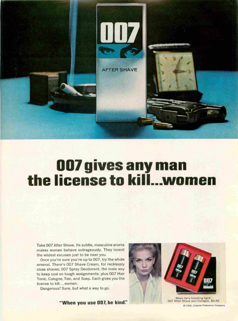
007 Advertising; not ageing well


007 sounds, in my opinion, quite irresponsible in handing out 'licenses' to 'any man' to 'kill women'; it honestly sounds like a gross misuse of power.

Although, I like the charming disclaimer: "When you use 007, be kind". When you kill a woman, please put a short, sharp bullet to the skull- a gentleman never lets a lady bleed out.